For my honours Experiential Learning Project, I proposed to re-design the physical environment of the Graphic Design Department space at VCUarts Qatar in order to be more student-centred, functional, and aesthetically vibrant. Not only focusing just on the Graphic Design Department, but also the Student Lounge, a space that is used by all students in all majors within VCUQ.
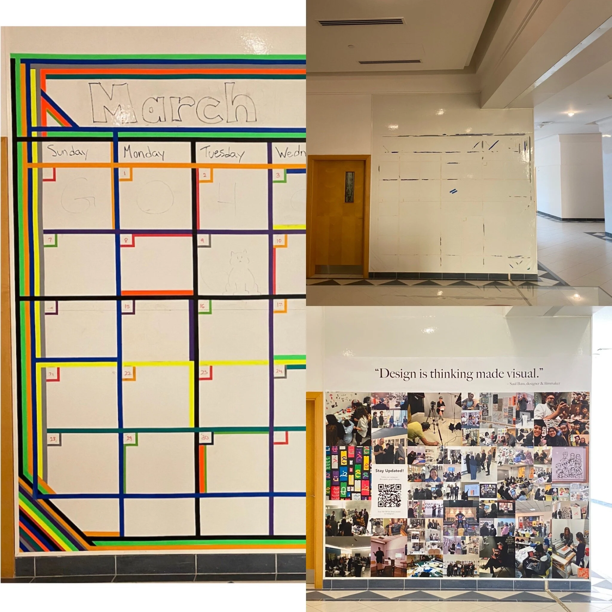
After returning to on-campus learning, the first task was to reactivate the calendar wall with new life. The calendar wall was not being used to its full potential and it became an eyesore to the majority of students and faculty. The reactivation included going on a trip down memory. To help bring joy back into the Graphic Design Department, Leland Hill (A GDES Professor_ and myself, gathered photos from our time in the department before COVID-19 hit Qatar and we went online.
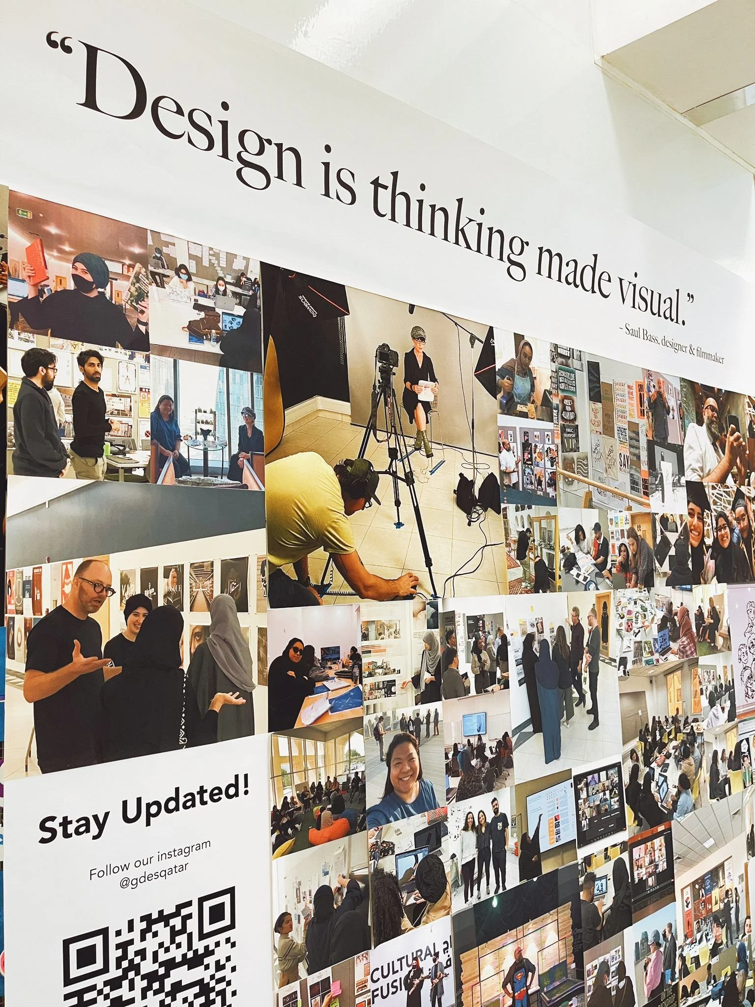
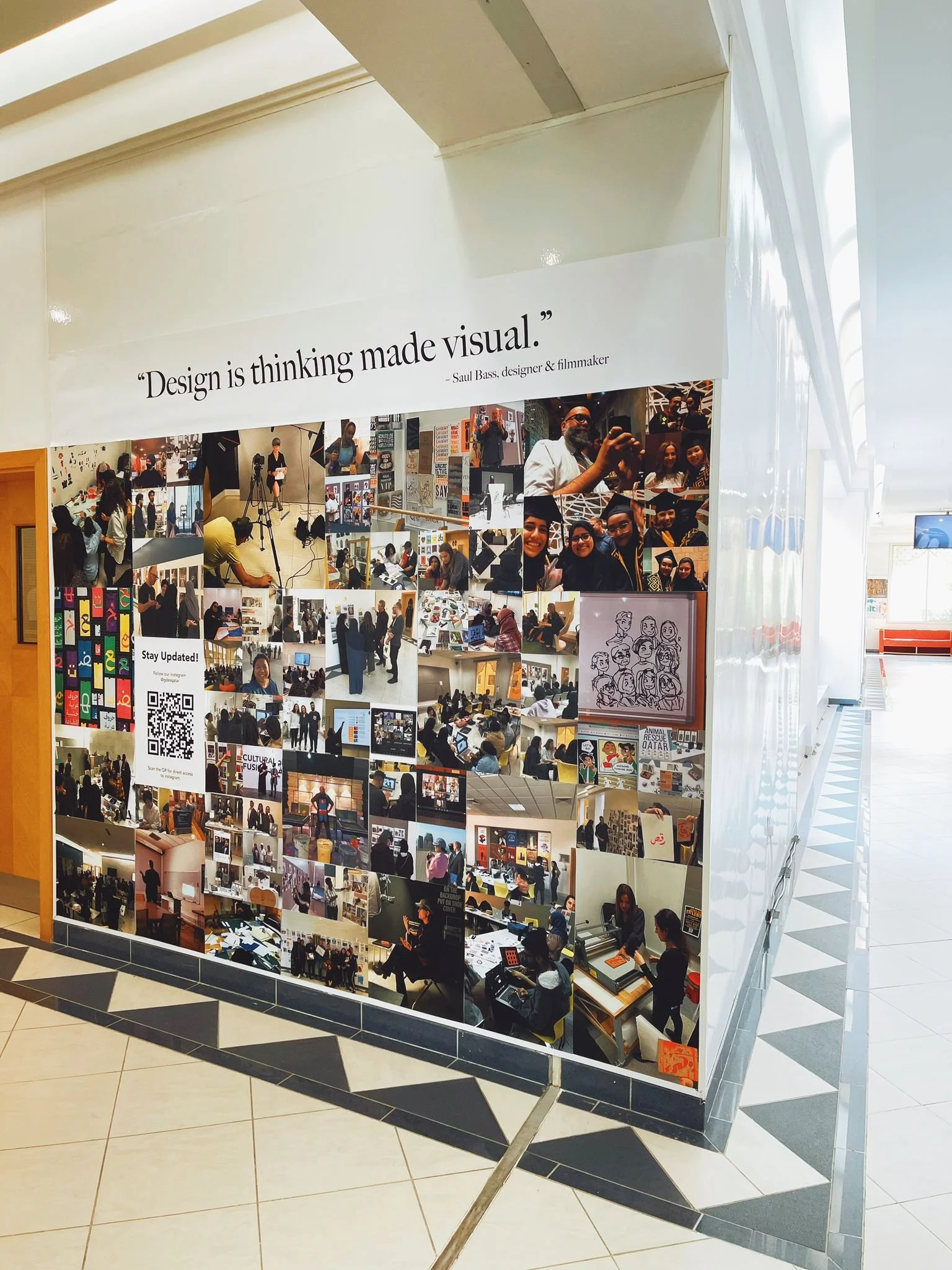
I created a grid structure and printed all images and they have been placed on the wall. Over time, due to the modularity of the photos and ease of printing, the photos can be switched out to stay updated with any upcoming events, talks, workshops or fun class activities within the department.
This wall is not only to be a photo wall for current students, but also to introduce future graphic design students to what happens within the graphic design department in VCUQ.
Part of my overall project was to bring life back into the student lounge.
Some of the restrictions I had to work with were:
Can not paint the walls.
New furniture has to have a durable life of at least 5 years.
Must be inclusive to all VCUarts Qatar Majors (including Art Foundation and FYI)
- Graphic Design
- Interior Design
- Fashion Design
- Painting and Printmaking
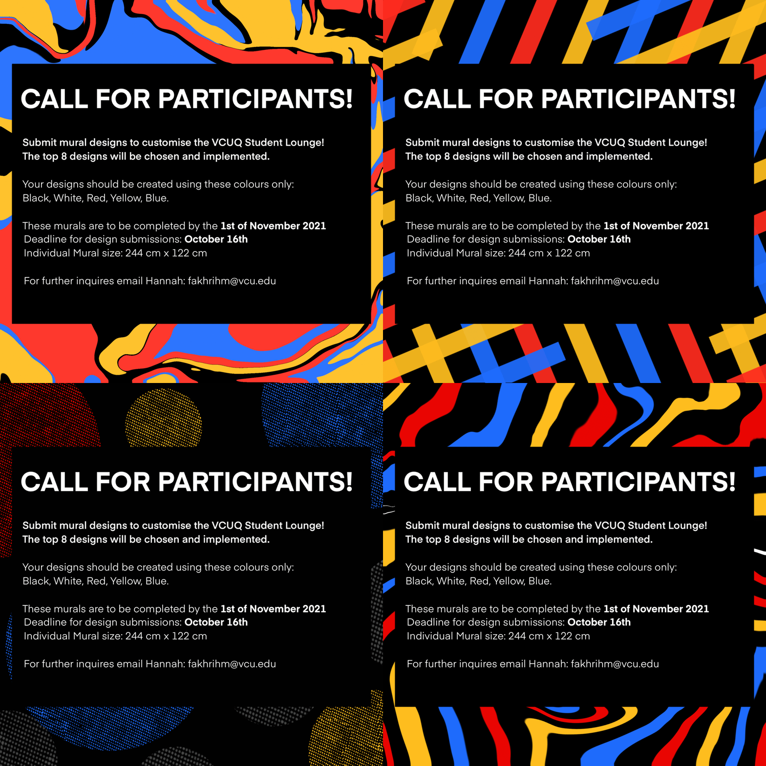
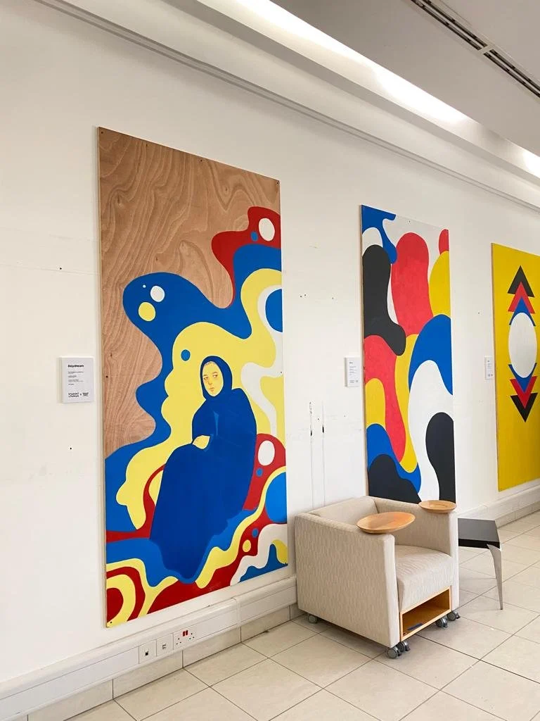
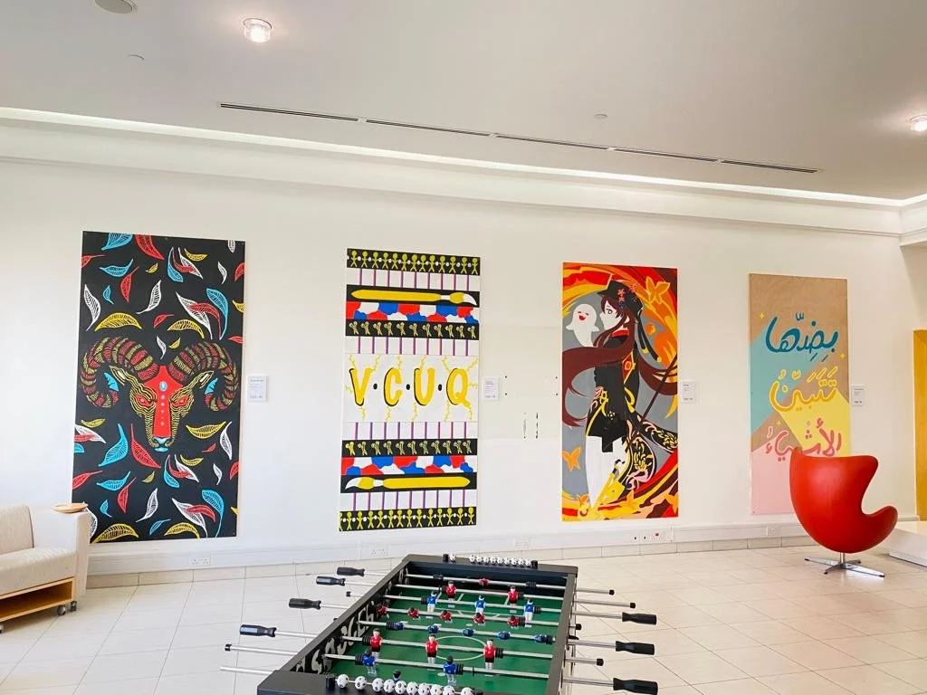
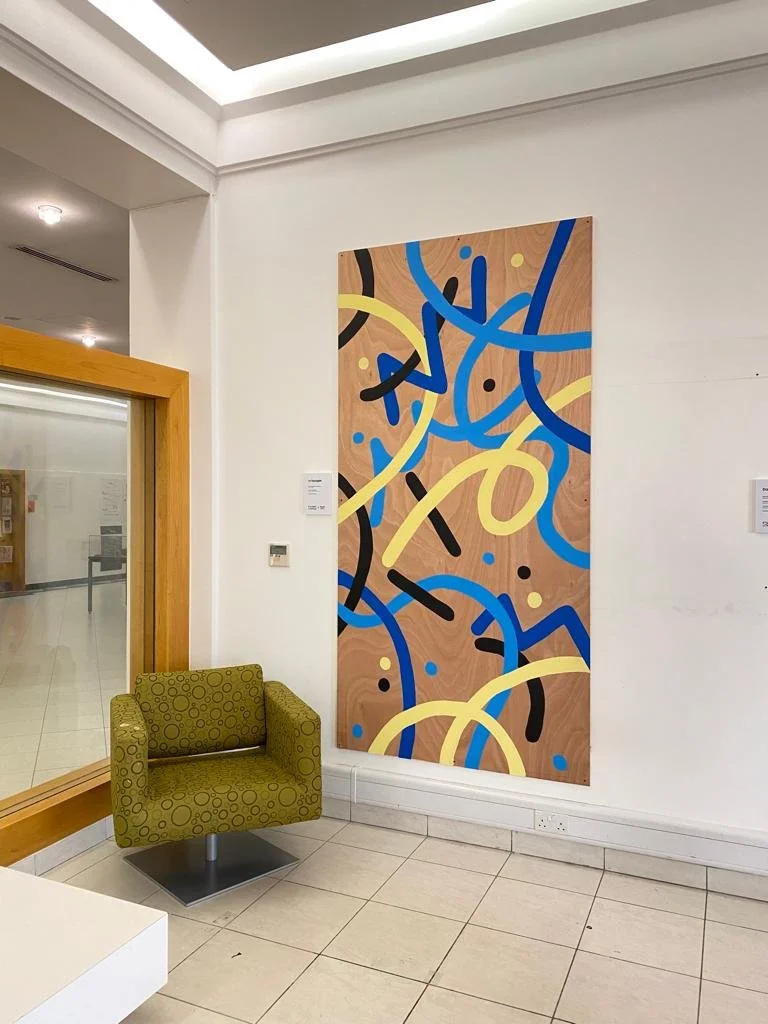
I had a dream of implementing colour into the lounge, but couldn’t paint the walls… so, my plan B was to initiate a mural activation space. I worked with my C<SAC colleague, Ghada Ali, to create an open call-out to the VCUarts Qatar community.
The 8 wooden panels are 244x144cm at 18mm in width.
From that, I received several submissions from Graphic Design, Painting and Printmaking and Art Foundation.
Throughout the project, the selected participants were given a set colour scheme - the primary colours - Red, blue, yellow and black and white.
The Department of Graphic Design at VCUarts Qatar plays a dynamic role in the region through education and research focused on cultural production, social innovation, and the preservation and development of typographic cultural heritage. The department hosts a diverse faculty together with visiting experts from the field who engage students in critical discourse, active research, and contextual inquiry within a future-oriented curricular environment. Students collaborate to explore a range of tools, materials, and modes of making to develop extra-disciplinary creative practices capable of reimagining the design’s role in society. Through these diverse experiences, students are empowered to become creative citizens, cultural participants, and active forces in the shaping of their world.
To start with, the brand should feel Playful, Innovative, Inviting, Colourful, Fresh and timeless. The plan was to create something that would remain timeless within the department and to include bilingual aspects. The main aspect of the brand was to represent the graphic design department to a wide range of people, inside and outside of VCUQ.
It follows the typographic focus the department is now taking. The extended typographic elements, like the E and the extended khasida represent the department moving into the present and the future. The bold san-serif typography is to make a statement while remaining true to the uniqueness of the department, the tail of the R represents that subtle personality.
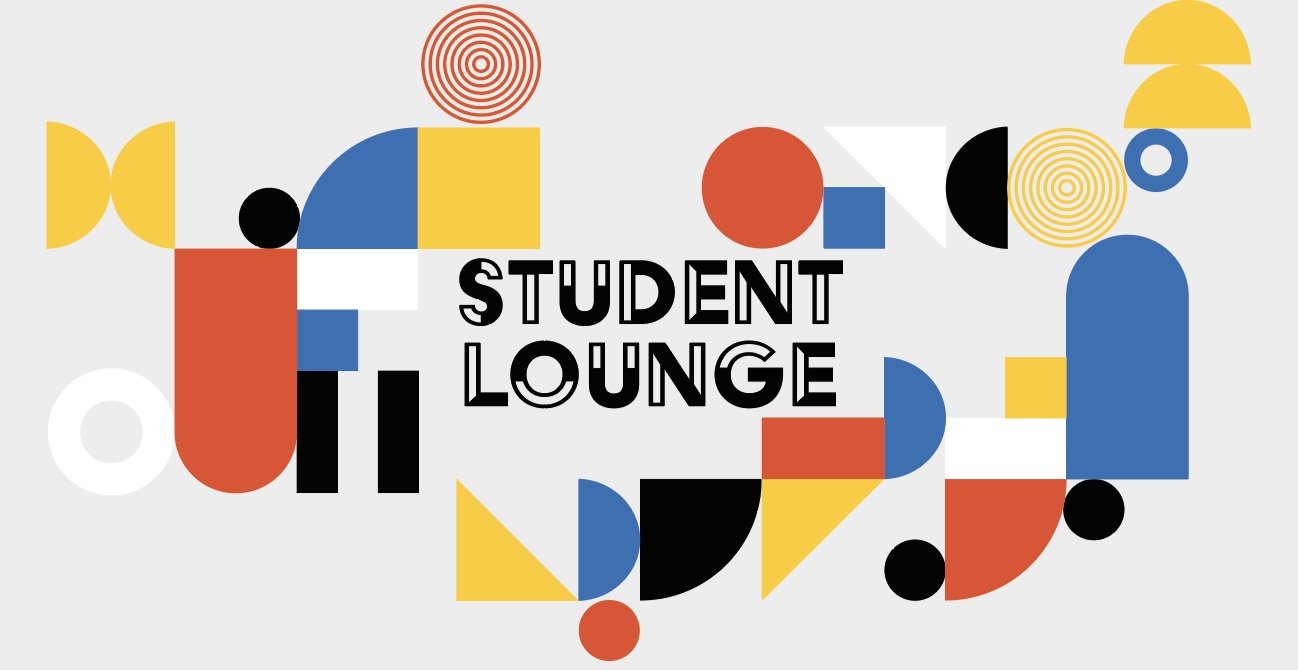
Utilising the primary colours and bold typography to revitalise the space and make a statement in an art and design university. The bold sans serif logomark makes use of the "S" & "L" of the name to provide quick recognition.
The primary logomark utilises the primary colours Red, Yellow and Black, which are VCU colours but they also make a bold statement in a once "plain" space.
The accompanying patterns designs follow the same colour scheme but utilise different shapes to represent building blocks. Rather than all shapes being the same shape and size, they are all different to represent the student body and their individual personalities and uniqueness.
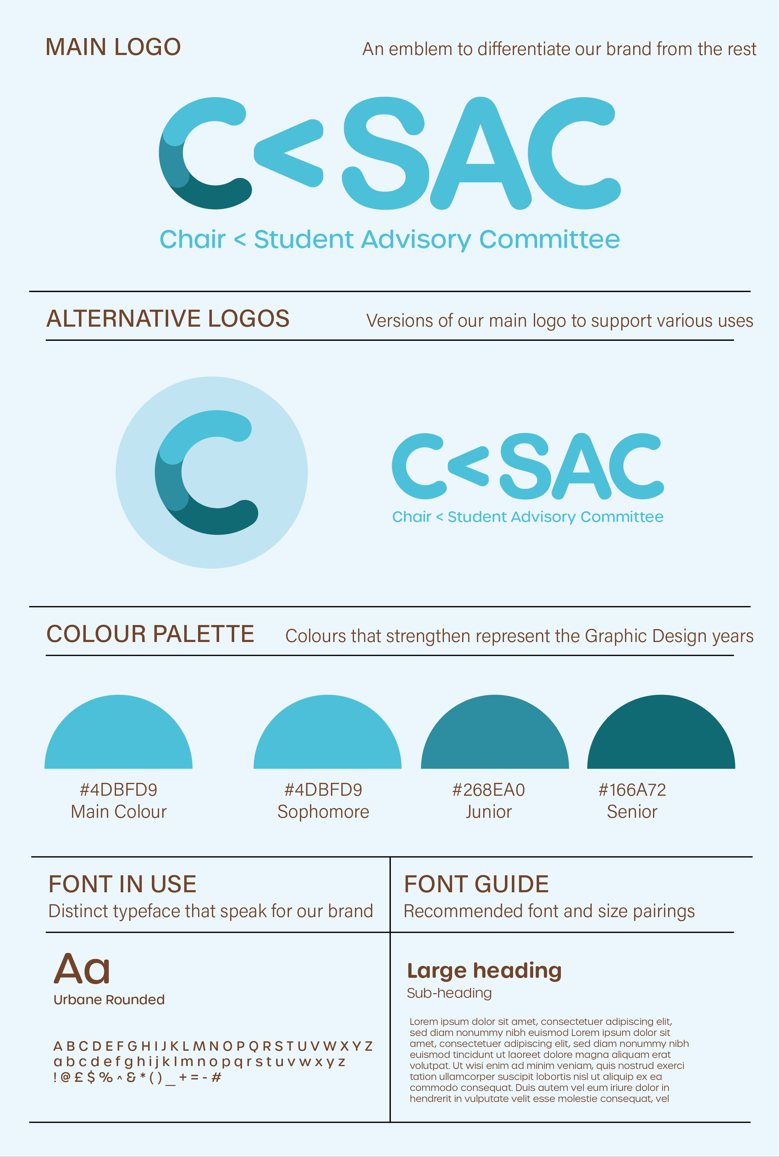
C<SAC (Chair Student Advisory Committee) is to advise the Department chair (Graphic Design) on the pulse of the department as well as to strategize collectively for positive growth.
At the time of completing my ELP Project, I was the C<SAC Chair and leader of all student representatives within the GDES Department.
I worked with a select few C<SAC members to help ideate and generate possible C<SAC Logo variations and then developed from there.